GRACE SEOW PHOTOGRAPHY
A hushed pursuance for stillness
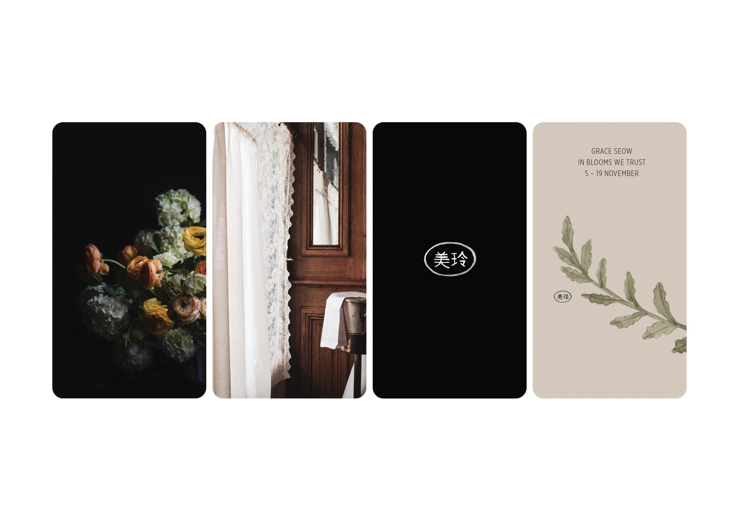
Visual poetry. Whispered moments. Like a bee to honey, Grace Seow is drawn to flowers. She has a gentle way of capturing their delicate and abundant beauty.
Working with Grace on the development of her branding story was a joy. Like old friends we shared stories. She spoke of her Malaysian Chinese heritage and the significance of representing it in her brand. We indulged in the details, the tones, the hues.


Grace’s Chinese name, Mei Ling means a beautiful tinkling of bell. I can’t get enough of this. There is a softness to Grace that I hope comes through in her visual identity.


Grace’s work brings beauty, calm and intrigue to a space. We identified her target market and ideal customer and mapped out the customer journey to identify key marketing touch points.


Paper stocks were chosen for their tactility and softness and the watercolours represented important aspects of Grace’s personal journey. Fine art prints and authenticity certificates are embossed with Grace’s Chinese name.


DESIGN Pip Howard
COMPLETED 2022
PHOTOGRAPHY Grace Seow
SCOPE Identity | Strategy | Illustration | Print | Packaging | Signage